If you'd like to display your ads on a responsive website correctly but don't exactly understand how to do that, this short article will help you. We will provide several options Adserver.Online currently offers. After that, you're free to decide which one suits you best.
Basically, there are 3 possible ways how to show ads on a responsive website correctly and we here we will explore each of them.
1. The first option is to create a zone with custom dimensions that have 100% width.
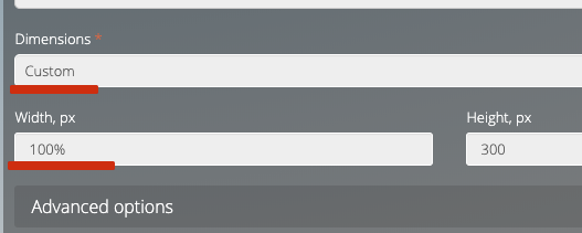
In this case, your image banners for this zone will be auto-scaled to full width. This is the easiest way but it may not work well for non-image ads.
2. The second option is to create 3 separate zones (one for each size you need) and 3 corresponding ads belonging to one campaign.
After that, you should implement some device-detection logic on your side.
For example, if your website detects a mobile device, it has to use the Zone1 code on the page, if desktop, then use your Zone2 code and so on.
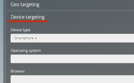
3. The third option is to have 3 separate campaigns (one for each size you need). Each campaign should have only one ad. Besides, you will need one zone that covers all sizes.
Have a look at this ad settings example:
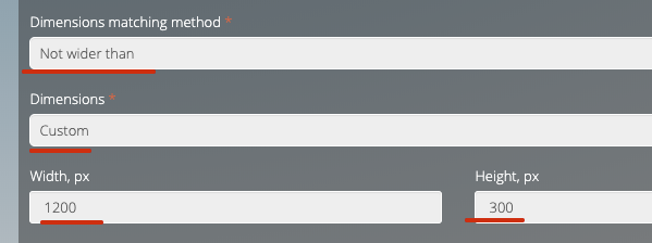
Each campaign should be targeted to a particular device and all the ads linked to the same zone.
Each of these approaches has pros and cons. You could try any of them and make a decision on which one to use. We hope this information on running ads on responsive websites will help.